CONSULTING WEBSITE
Designed and built the Millennial Consulting website
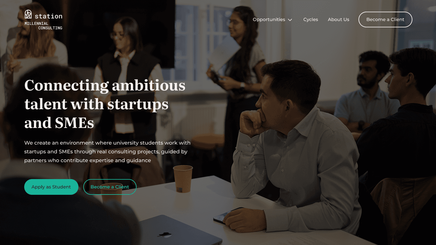

The Millennial Consulting website is a digital platform designed and built to clearly communicate the organization’s purpose, offerings, and consulting cycles to students, startups and SMEs, and partners.
Timeline
From initial research to a fully launched website in approximately six months, designed and built alongside full-time employment and parallel responsibilities within Millennial Consulting, followed by continuous optimization.
Background
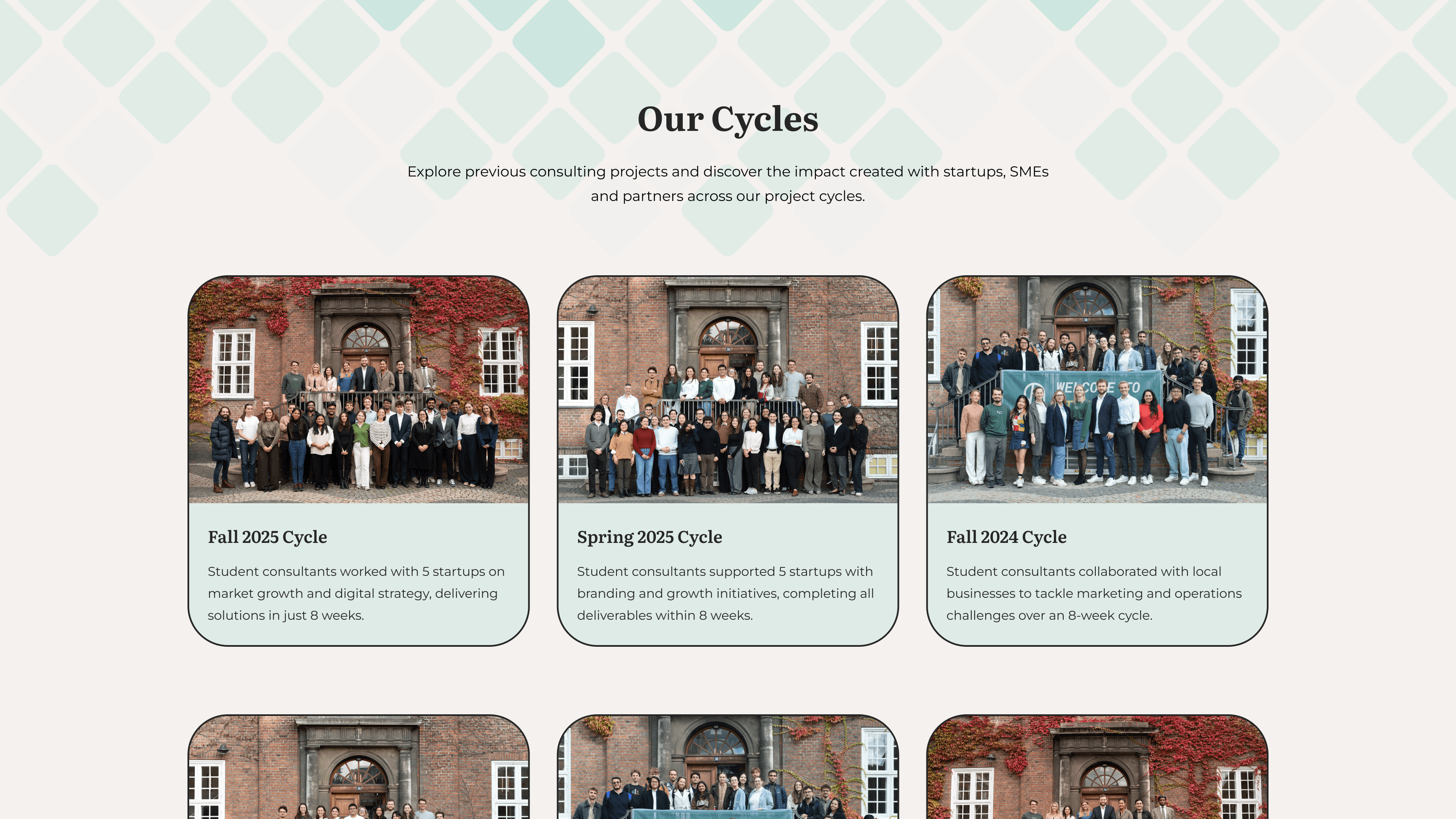
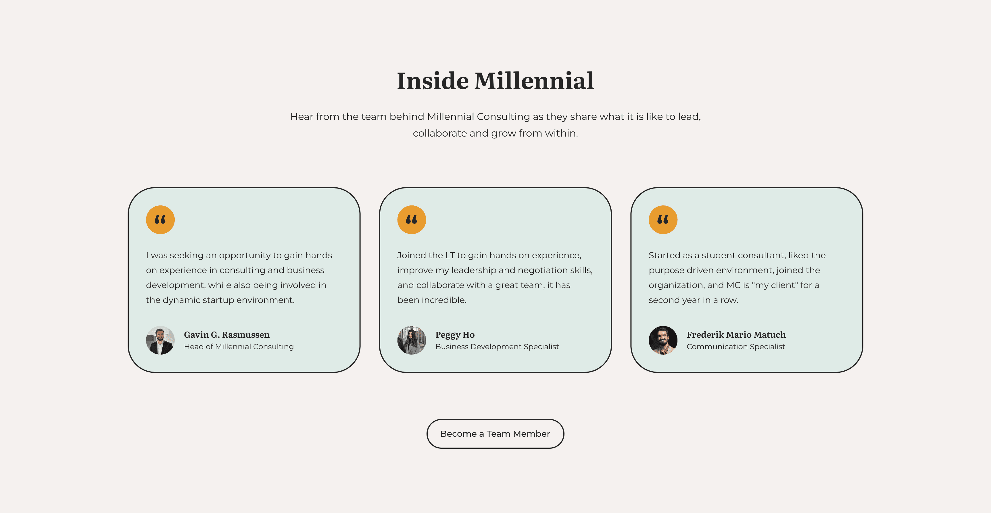
Millennial Consulting is a non-profit junior consultancy where university students collaborate with startups and SMEs through real consulting projects. The website serves as a central platform that explains the consulting cycles, highlights ongoing initiatives, and supports clear communication across students, clients, and partners.
By providing a clear overview of how collaboration works, the platform helps align expectations and makes it easier for stakeholders to engage.
This category details the step by step approach behind designing the new Millennial Consulting website, covering research, site structure, visual exploration, wireframes, and the design system.
Research & Analysis
I began by auditing the previous website and reviewing similar consultancy platforms to understand common structures and expectations. Supported by surveys and conversations with students, clients, and partners, I identified patterns and organized the insights shown below.

Sitemap & Structure
To define the website’s structure, I mapped out the core pages and user pathways based on the research insights. The sitemap clarified how students, clients, and partners navigate the site and helped determine the placement of key content before moving into wireframes.

Visual Exploration
To establish the visual direction, I explored layout styles and UI patterns through a moodboard combining similar consultancy platforms, modern interface inspiration from Dribbble, and early AI-generated concepts. This helped define the overall tone, spacing, and visual language.

Wireframes
With the structure and visual direction defined, I created wireframes in Figma to explore layout options and test content structure across key pages. Informal feedback from team members and stakeholders helped refine clarity and navigation before moving on to higher-fidelity designs.

Design System
To ensure consistency across the website, I developed a simple design system covering color styles, typography, spacing, imagery, icons, and components. This foundation made it easier to scale the visual direction across pages and transition into high-fidelity designs, as shown next.

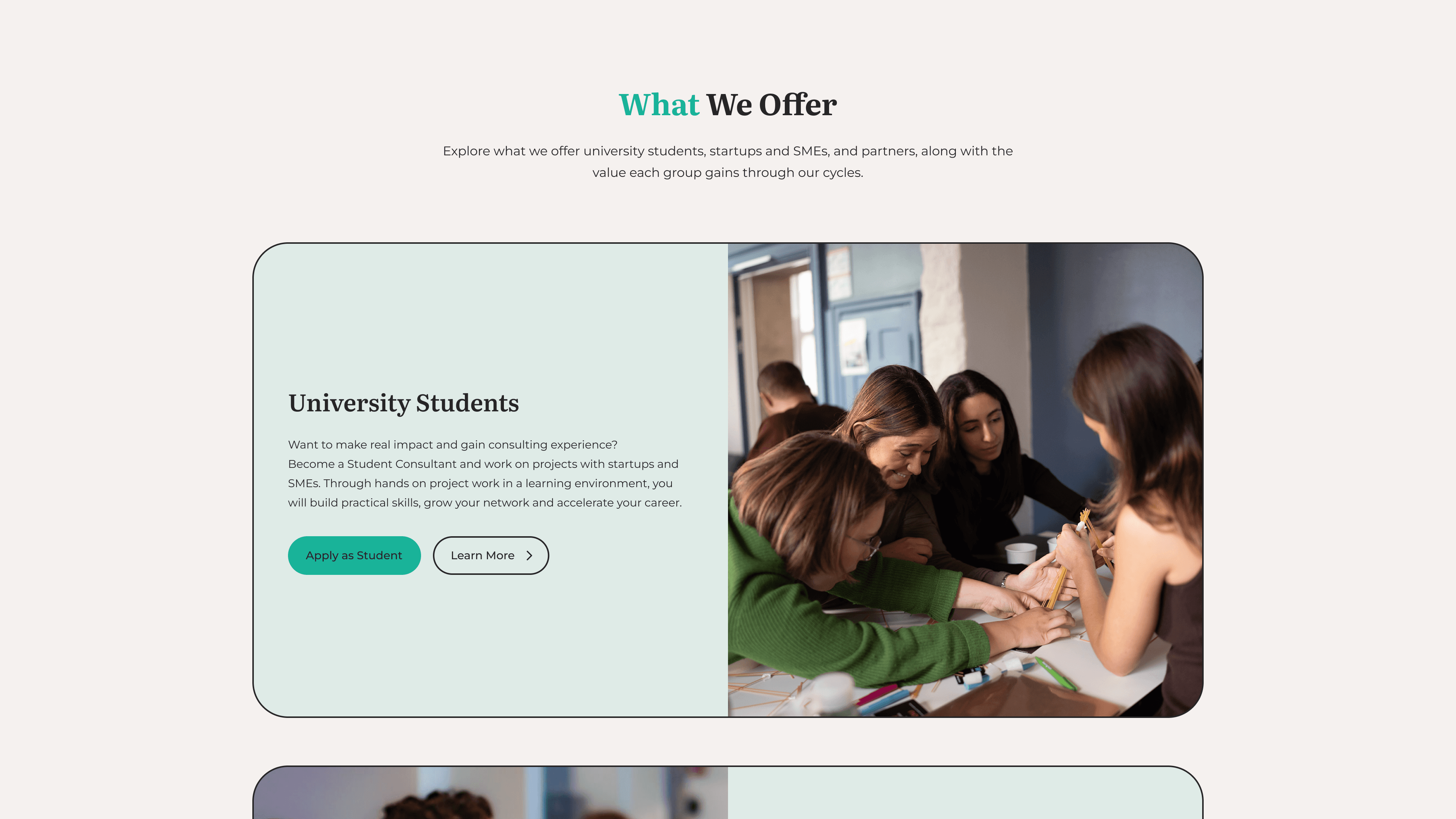
The new website improves clarity across audiences, making it easier for visitors to understand Millennial Consulting and engage with the right opportunities.
Clearer Communication
The website presents the organisation, consulting cycles, and opportunities more clearly, helping visitors understand what Millennial Consulting does and how to get involved.
Simplified User Paths
A clearer site structure guides visitor groups through a simple path, helping students see the value, startups and SMEs understand the process, and partners see how involvement works.
Consistent Page Experience
A familiar, unified page structure makes the website easier to scan and understand, while reusable building blocks keep the experience consistent and scalable as the organisation grows.


Here, the project's key outcomes are highlighted, including improved clarity, smoother user journeys, and a more consistent visual experience.
Improved Clarity
Visitors now understand Millennial Consulting’s purpose, consulting cycles, and opportunities more quickly, giving them a clearer sense of what the organisation offers.
Smoother User Journeys
Students, startups/SMEs, and partners reach the information they need with fewer steps, supported by clearer pathways that make navigation more straightforward.
Stronger Brand Presence
A more unified visual expression across pages gives Millennial Consulting a clearer and more professional online presence, making the website easier to recognise and understand.